What is design? I am no guru and all, but over the years in the design industry I shaped my view on it. For me, design is a problem solving mechanism. Its primary function is to provide solutions in order to meet specific goals set in mind. By observing, exploring and then exploiting that gathered knowledge, design creates tools and services which ease up our life.
Now what is good design? That’s a tricky one because good often comes off as beautiful. But this is art terminology. Design is all about function – it’s not how it looks, it’s what it does. Can it be beautiful? Well of course. Make the two meet and hallelujah – good design! A very clear example for me is typography: make the font fancy but unreadable and you eliminate all access to content.
All About Design
Design is all about function – it‘s not how it looks, it‘s what it does.
Creative project by Giuseppe Colarusso mocks the usability of everyday objects.

How to achieve it?
This I still don’t know. At most it is a try-and-fail process, but as Edison once said, “I have not failed, I’ve just found 10.000 ways that won’t work.“ Design is about iteration and correction. To reach that momentum of commonsenseness is a painstaking task. Look at touchscreens – for 2 billion years we had fingers, yet some companies still made us use a stylus. It’s hard to apply commonsense on the first attempt.
That’s exactly how I felt working on my latest project. I had to redesign ImpressPages for a 4.0 release. It’s a web development and management tool I co-founded with two of my friends. While they were busy scraping up the code and making business calls, I had to refurbish the interior.
Our previous version was delivering but we felt the user experience could be improved. We still had some issues with content managers and their activity in the UI. So I put all my knowledge to work and came up with these three steps that kinda got me where I wanted.
Three steps to good web design
1. First of all, think of design as communication
It’s about the dialogue between user and technology. When designing a new user interface, I always think of it as a party where they either meet and talk or don’t. And I want them to meet! I don’t want it to be a gatsby-like crowded fiesta where you get lost the minute you come in, I want it to be a cozy get-together where user and technology can become better acquainted, maybe go on a second date or so.
I can do it by making my design aesthetic. Don’t fight it, it’s always more appealing to try a tool that matches your beauty perception. But for the relationship to grow, user and technology need to be compatible.
In other words, design has to match the capabilities and expectations of the user. Consider why Reddit and Hacker News are so popular regardless of their messy interface. Because the target audience is mostly programmers who are used to small fonts, long lines, no typographic hierarchy, numbers and symbols all over the place (no disrespect intended!).
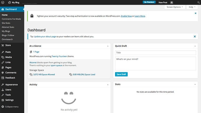
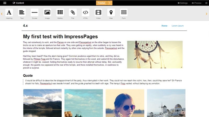
In my case it was not the programmer, it was the content manager. An upfront type who rarely looks for the backdoor. So we made our technology upfront – with inline editing you can do what you came for. Instantly. The moment the user opens up ImpressPages, he’s in touch with the tool. Compared to WordPress, where you get all the tools first and the eventual website preview later, with ImpressPages and the inline editing approach we inverted the whole website management process (see images below).


2. Second step is to prioritize and organize your stuff
Try your best to provide the user with a clear and consistent logical structure. Most importantly, think of the main activity your user needs to perform. It will serve as the backbone to your scheme.
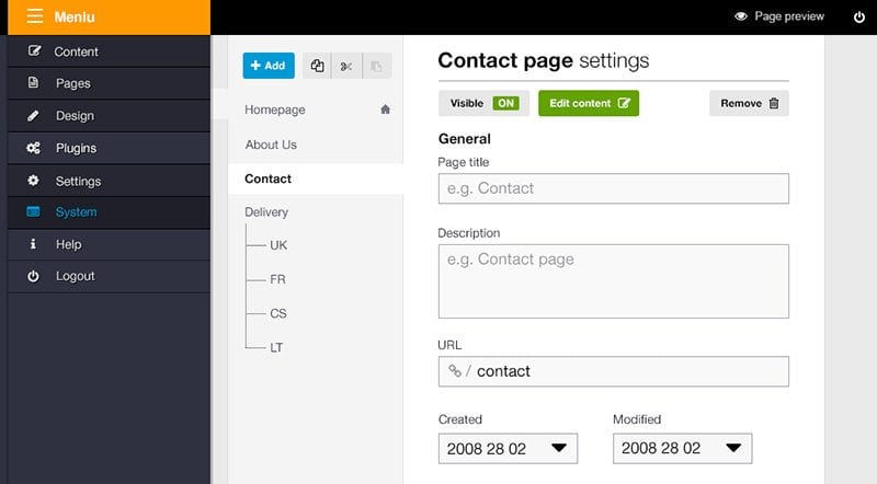
The challenge here was the ImpressPages admin panel. Up until now we had 5 sections with 19 sub-sections! Crazy. But please understand – the goal was to give our users simple access to all the functions provided. Along the way we realised this access was not that simple.

Basically, this admin panel had to serve as a crossroad to the developer and content manager. Each had to choose work related paths and not overwhelm each other along the way. So instead making everything wider we made it deeper. Five sections stayed but all the sub-subsection components were thoughtfully organized, merged or included into one another. For example, we merged Languages, Menu and Pages sub-sections into one Pages section. To keep everything clear and straightforward, the management experience is even and consistent.

Another thing…
Why in God’s name do you shut down a Windows PC by clicking a button called “Start”?– David Pogue.
Organizing does not only mean putting everything in order. It has a lot to do with naming everything correctly. Avoid double meanings, especially avoid using different keywords in different places. And it’s one of those times when shorter is better. One, two words tops have to express the function behind the button!
3. The final step – maximize
With a clearly defined activity and structure in mind, try to reduce the noise as much as possible. This is very closely related to organizing stuff so if you had the previous done right, maximizing shouldn’t be a struggle.
Part of designing a good to use interface is not deciding which features to add, it’s deciding which ones to leave out – David Kelley.
The biggest challenge here was the widget bar. It was overcrowded. Before we had too many separate widgets, like Text and Rich text, Image gallery and Logo gallery. This was clearly unnecessary as the two functions could be easily performed by one button. Plus, we eliminated the need for a Column and Text with image widgets by making it possible to simply drag & drop widgets into one another.
I know it’s very tempting to have this, and this, and ooh look at that!And it’s ok as far as you remember that people on the web (including you and me) are lazy. So it’s better when everything’s done with less clicks. {that true less is more cliche here}.
To keep things uncluttered, designers must be even a little dictatorish. You will always get requests to include this and that – some like blue over green, some need a newsletter form more than an image widget. Prioritize according to the most common user actions and practices. I said “a little dictatorish” so I mean you have to provide them the ability to add more if needed. Thus, in ImpressPages any developer can create and add their own widgets according to his or his client’s needs.
Moreover, understand that users like to see how they’ve improved. For this we decided to keep the basic interface simple with the ability to extend it by the user himself. As Dan Norman puts it, “the individual is a moving target; design for the individual of today, and the design will be wrong tomorrow, this is because as individuals gain proficiency in usage, they need different interfaces than were required when they were beginners.“
Conclusion
These three steps alone don’t guarantee good web design. What they do is they clear out some air. If you do these things correctly, chances are the important ‘function’ part of good design will be taken care of, what’s left will be the aesthetics.
Then again, this is just my experience. Share your insights and stories!


